"Beyond the Veil" is a conceptual design project that uses music as inspiration to explore universal emotions and transcendental themes such as fragility, death, time, passion, and connection. Although the main focus is visual, the songs, based on poems by Emily Dickinson, serve as a starting point to develop a complete aesthetic experience. This project is articulated through a carefully designed visual system, where colors, elements, and compositions reinforce the message of each piece, while animations and graphic elements enrich the narrative of the songs.
For its realization, various graphic elements have been designed, including: the album cover, artwork and individual animations, the album booklet, physical formats, tarot cards, and merchandising.
VISUAL SYSTEM
The visual identity of the album is characterized by a realistic style with dreamlike nuances. Each illustration combines real and recognizable elements with settings that transcend physical logic, creating an atmosphere of mystery and reflection. These images evoke memories and dreams, connecting the viewer to the conceptual themes of the album.
The intentional use of emptiness in the compositions represents transcendence and the solitude of the afterlife, the passage after death that reinforces emotional depth.
To extend the reach of the visual identity, the graphic elements were adapted to versatile formats through vector illustrations.
The texts adopt a fluid layout, evoking the movement of water, which changes according to the emotion and the corresponding song. This movement can be gentle and calm or stronger and more intense, reflecting the emotional narrative of the project.
Color Palette
#273040: Symbolizes death, the vastness of the ocean, and the unknown.
#abab99: Evocative of memories and transitions between past and present.
#e6e5e4: Brings fragility and serenity, balancing the compositions.
#ffffff: Reserved for key moments in the narrative: symbolizes purity and transcendence.
Typography
PRIMARY: Baskerville – Evokes the era of Emily Dickinson.
SECONDARY: For the song titles, a vintage typeface inspired by old stamps is used. These titles appear over a background of torn paper, adding visual contrast and reinforcing the themes of mystery and transcendence.
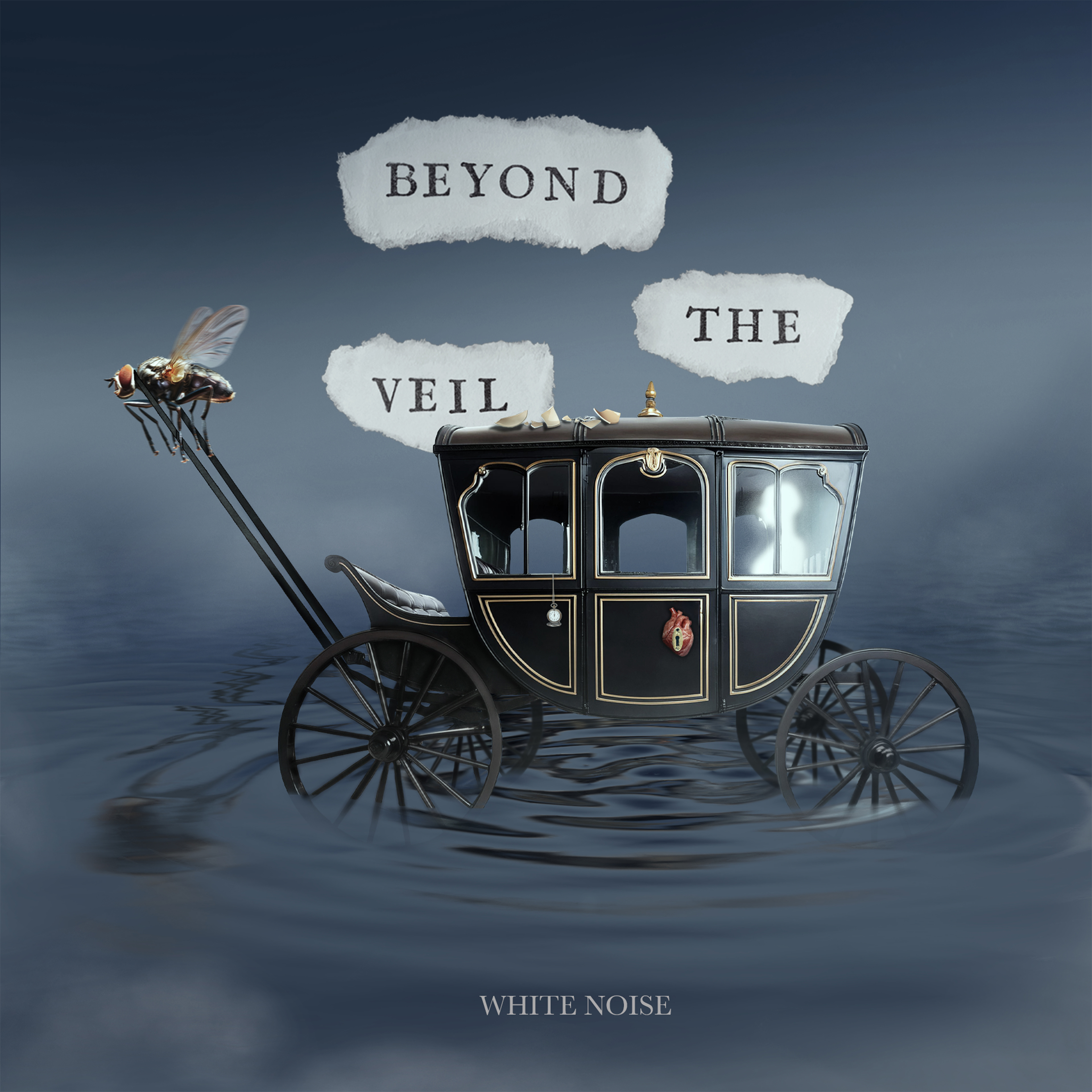
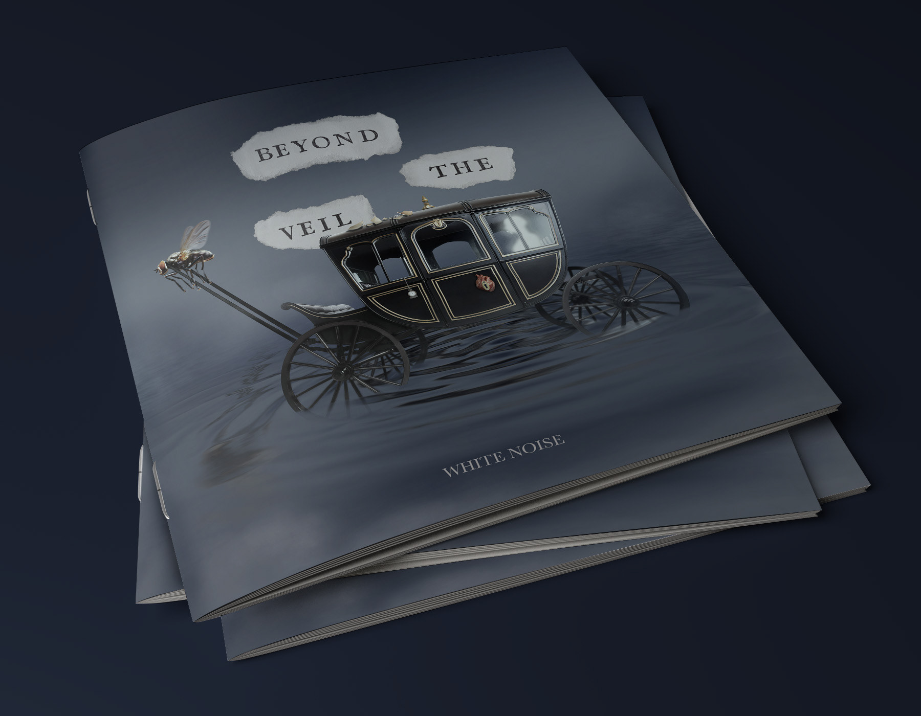
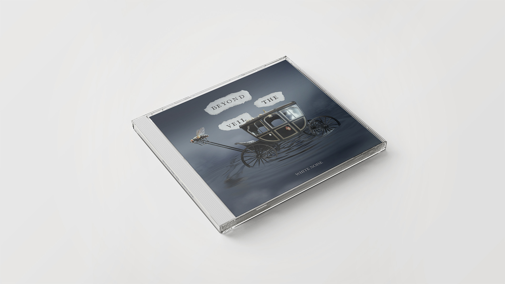
ALBUM COVER
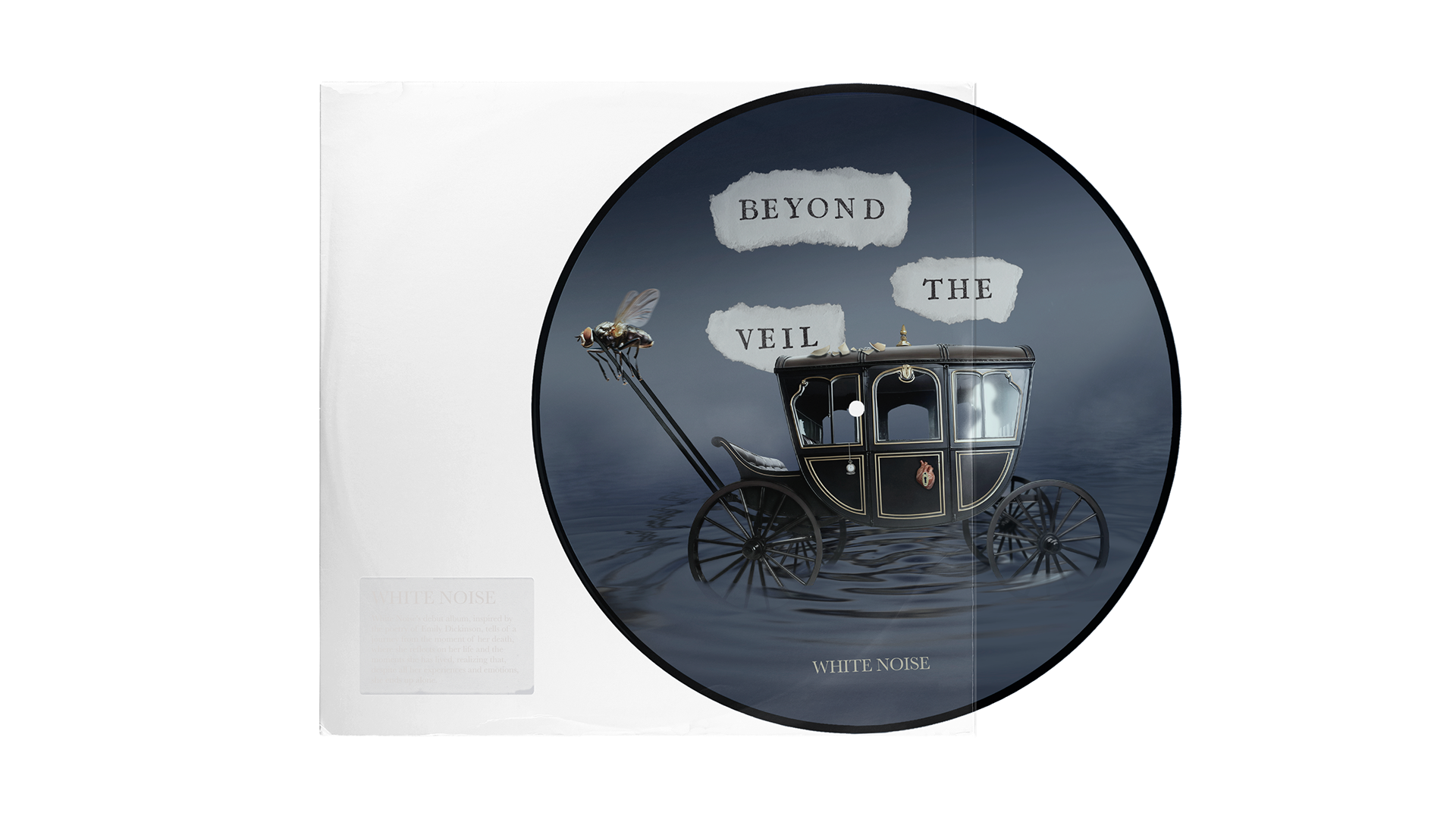
Each element of the cover represents a song from the album, contributing to a visual narrative about the journey into the unknown.
In the center, the black symbolizes the passage between life and death (Eternal Ride), slowly moving across a dark (Into the Sea’s Embrace). The reinforces the feeling of solitude and mystery (The Silence of Solitude).
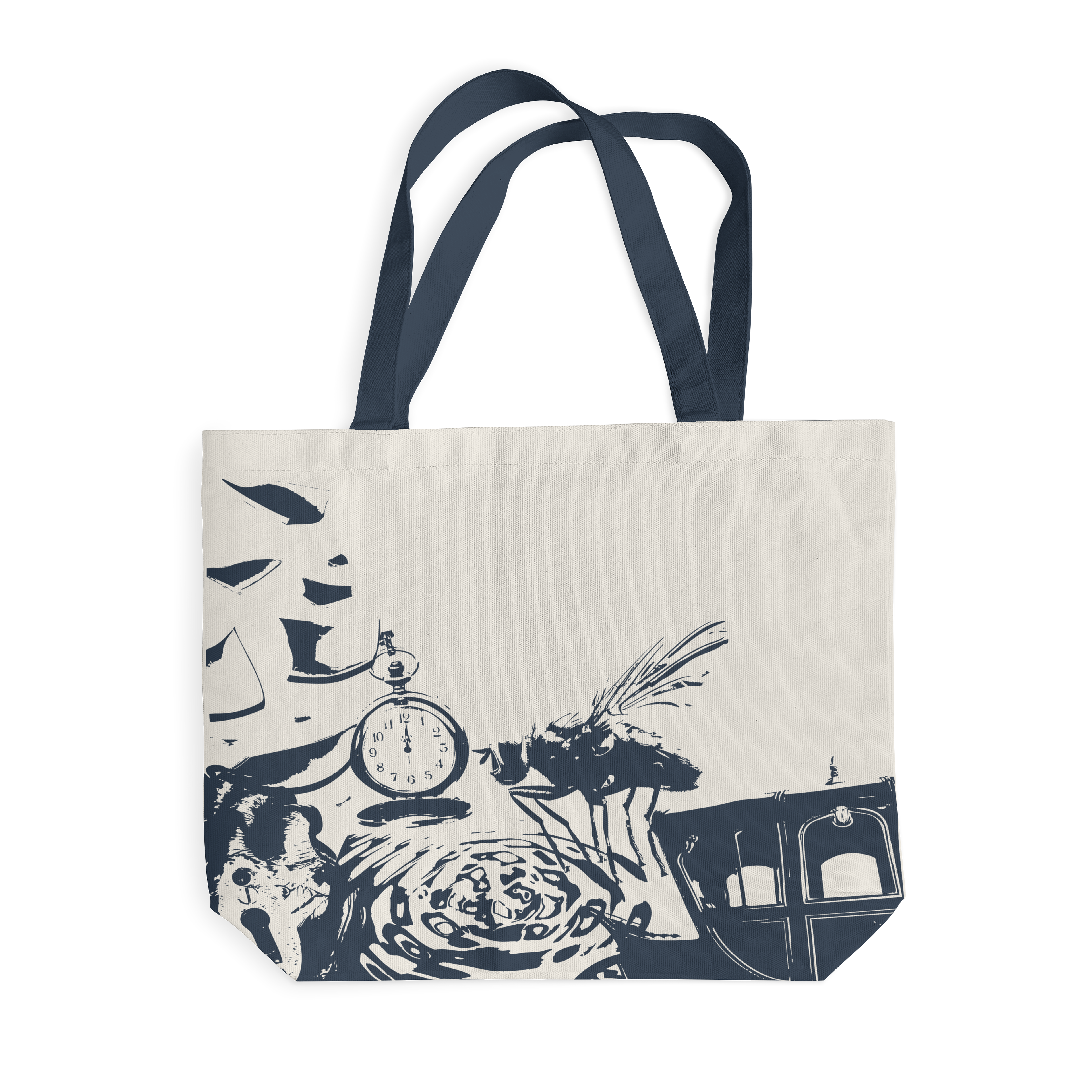
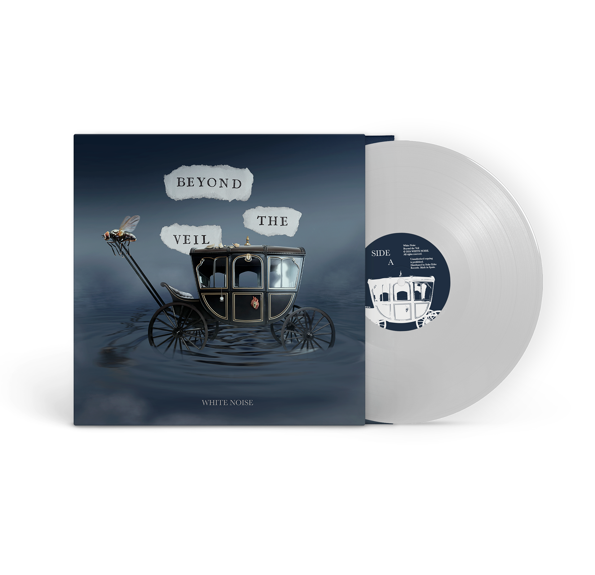
The pulling the carriage, inspired by The Fly's Whisper, represents the exact moment of death, capturing the fragility of time.
The symbolizes the singer (I’m Nobody), a representation of the soul that fades but persists in its journey.
The suspended on the carriage reflects the fleeting nature of time (Moments of Forever), while the closed symbolizes the decisions of life (Chosen Realms). The on the doorknob reinforces the symbolism of love and protection (Untamed Nights).
Finally, the on the carriage represents broken relationships and bonds (Unseen Bonds), which, though lost, remain part of the journey.
Thus, every visual detail reinforces the themes of the songs and contributes to a reflection on life, death, and what we leave behind.
ARTWORKS
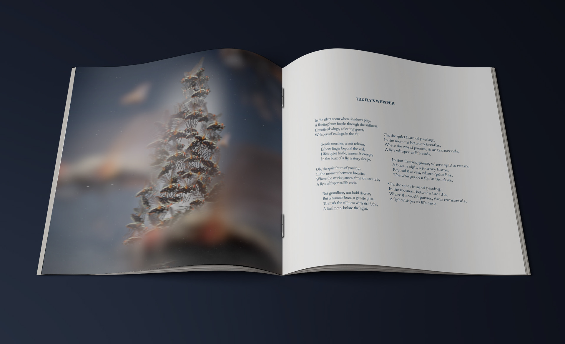
The Fly's Whisper: The central figure of the cover is a fly, symbolizing death. White Noise is formed by a swarm of flies, representing the process of imminent death. The flies, arranged in different planes, create an unsettling atmosphere that reflects the fragility of life and the inevitability of death.
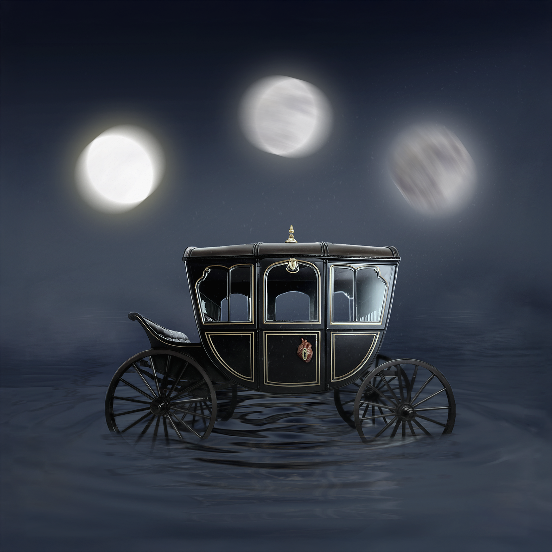
Eternal Ride: The floating carriage in a dark void symbolizes the irreversible journey into the unknown. The glowing moons add a mystical touch, suggesting that death is a step toward the infinite, beyond the earthly realm.
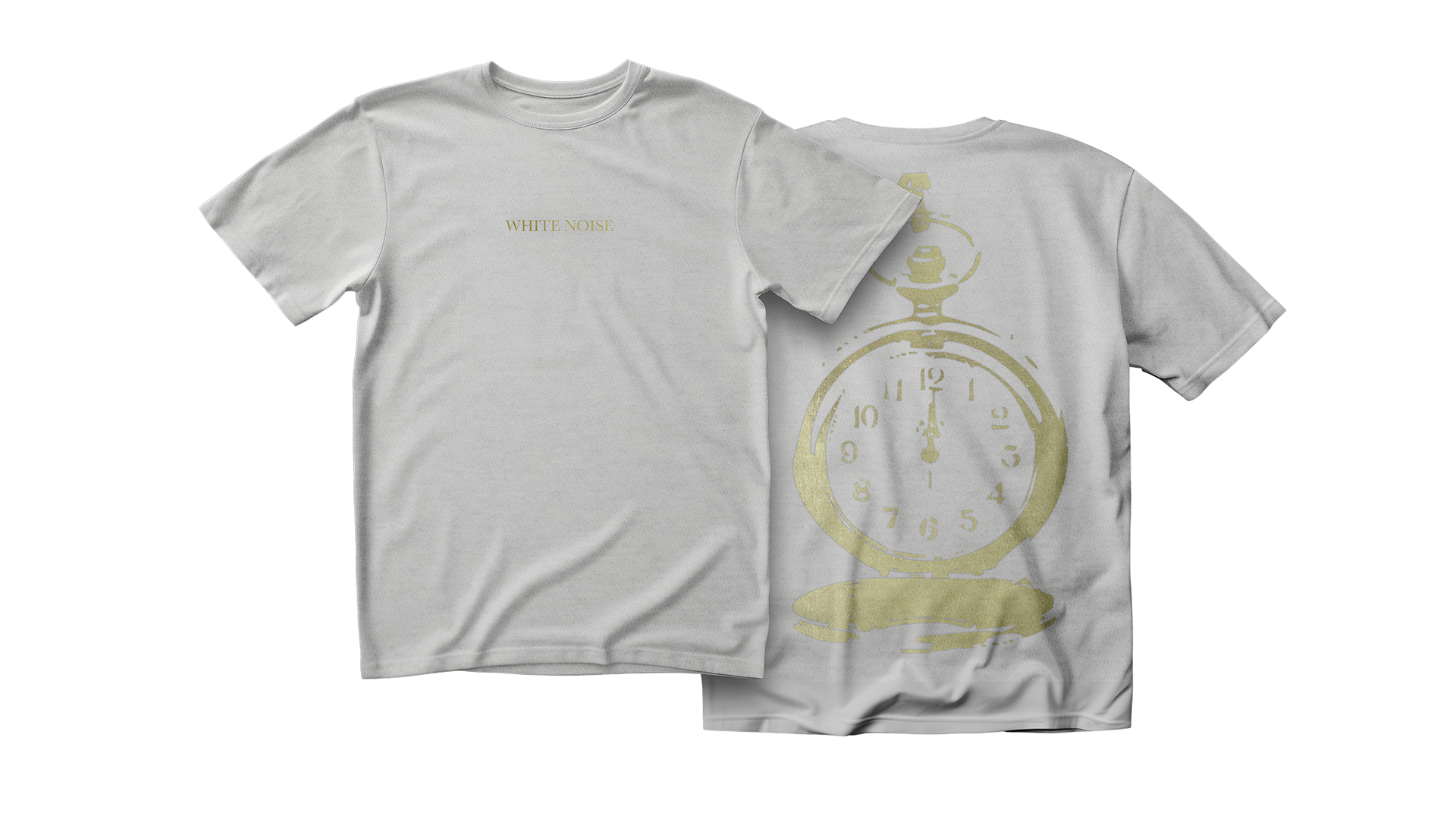
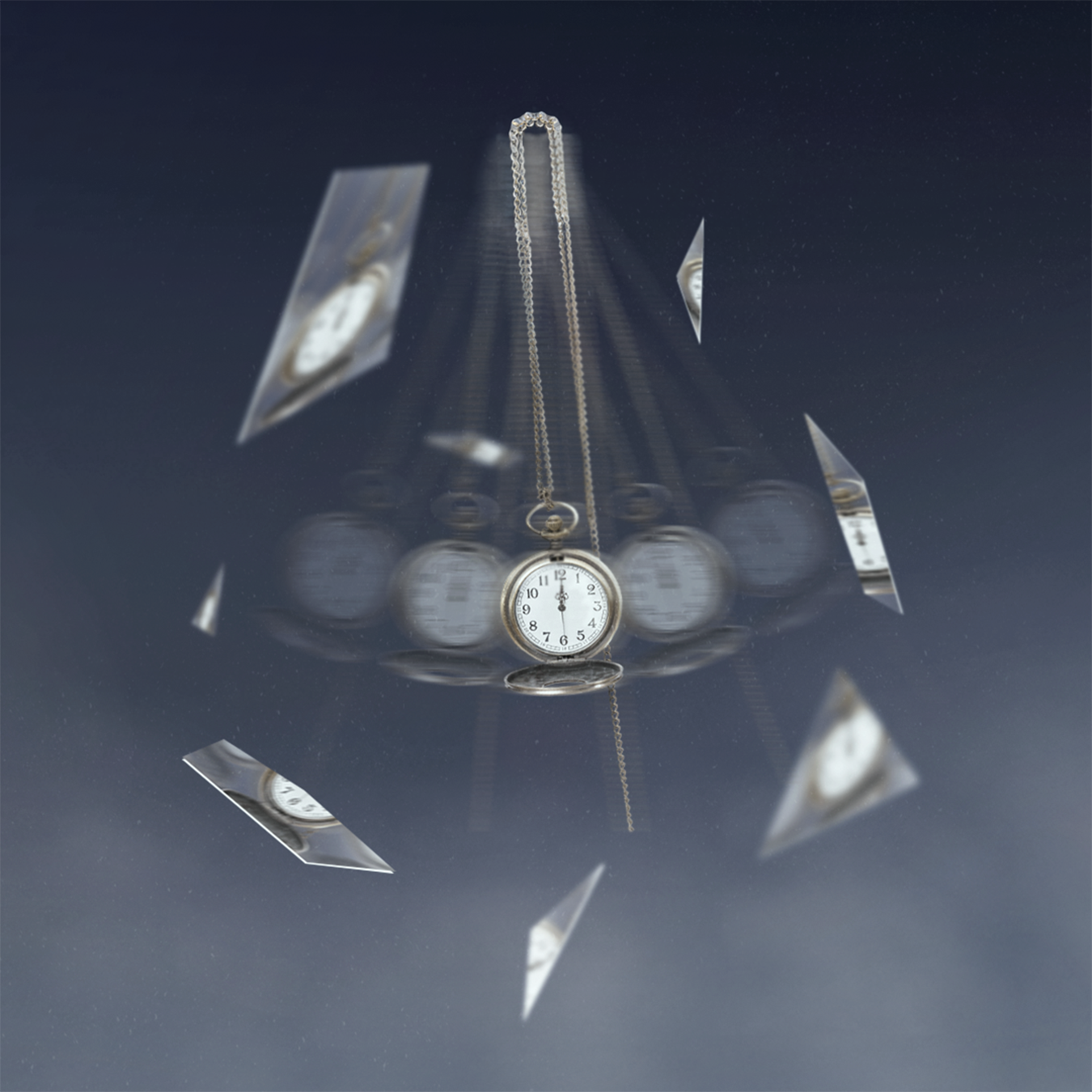
Moments of Forever: A clock suspended in the air symbolizes the passage of time, moving against a blurred background. Broken mirrors reflect the clock in different directions, representing how time fragments and disperses into our memories and experiences. This fragmentation connects the past, present, and future.
Into The Sea's Embrace: The water symbolizes death with its turbulent movement, while the reflection of White Noise suggests the transition into the spiritual. The golden spheres represent transcendence, and the contrast between light and darkness creates an atmosphere of change and reflection on death.
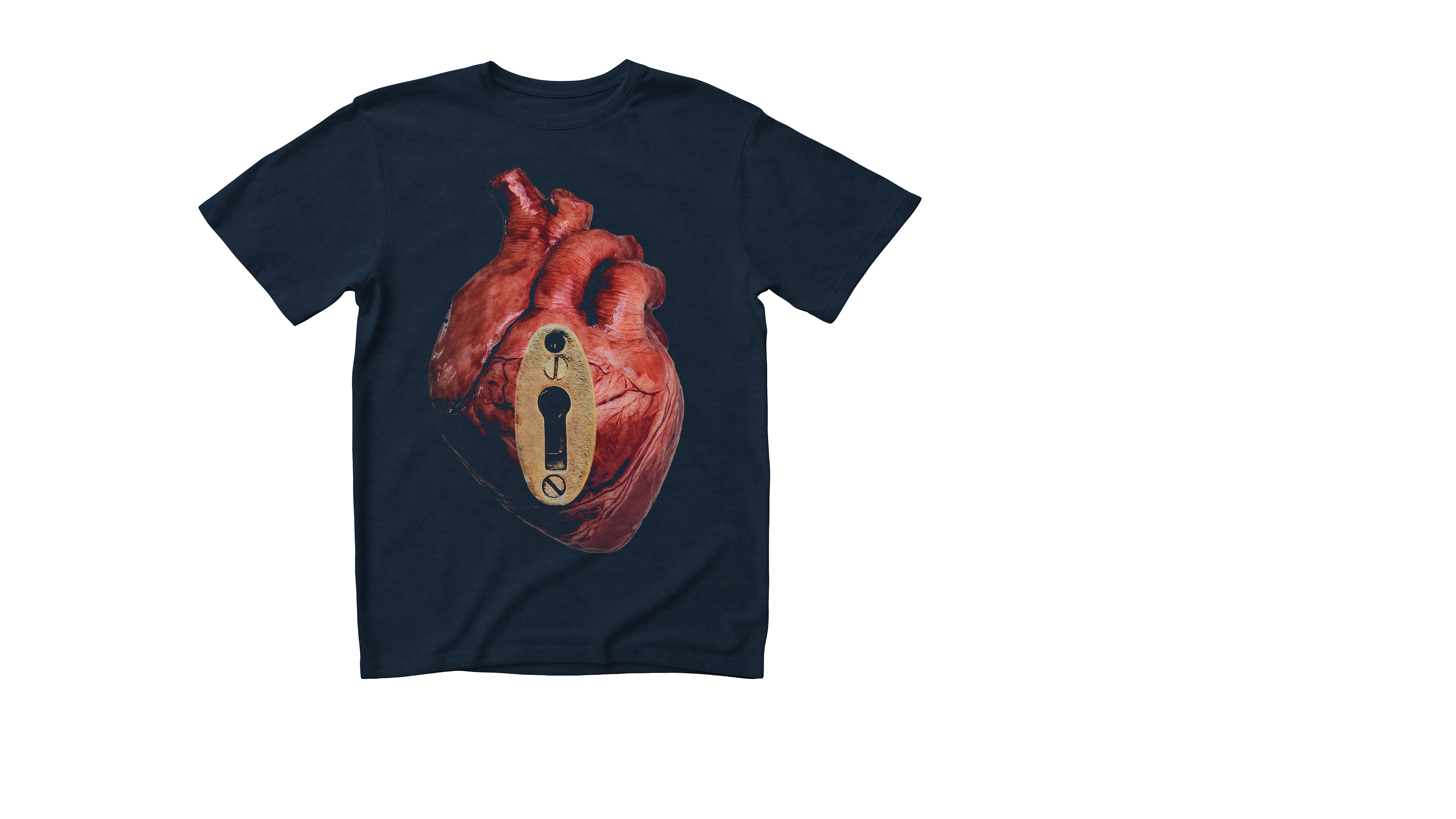
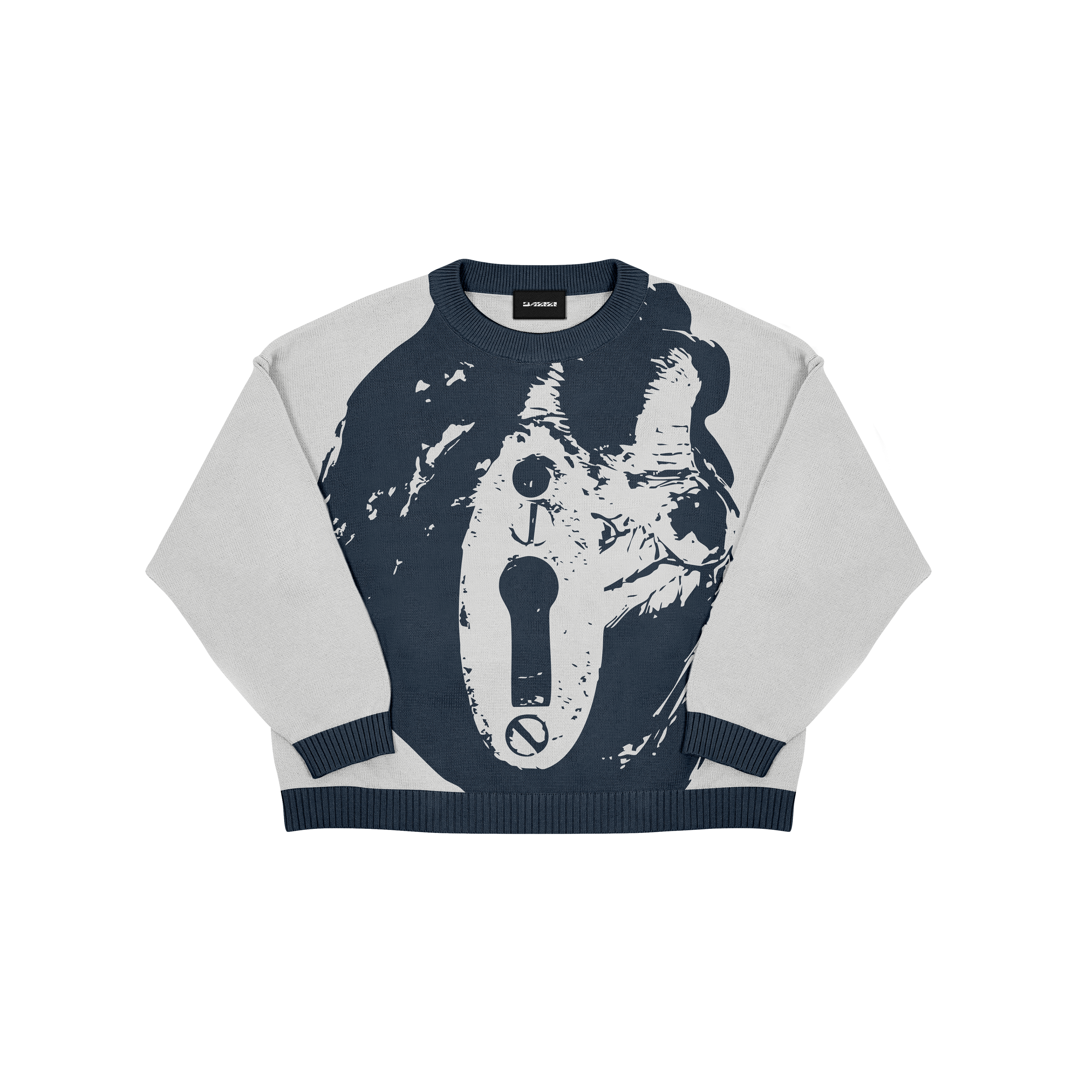
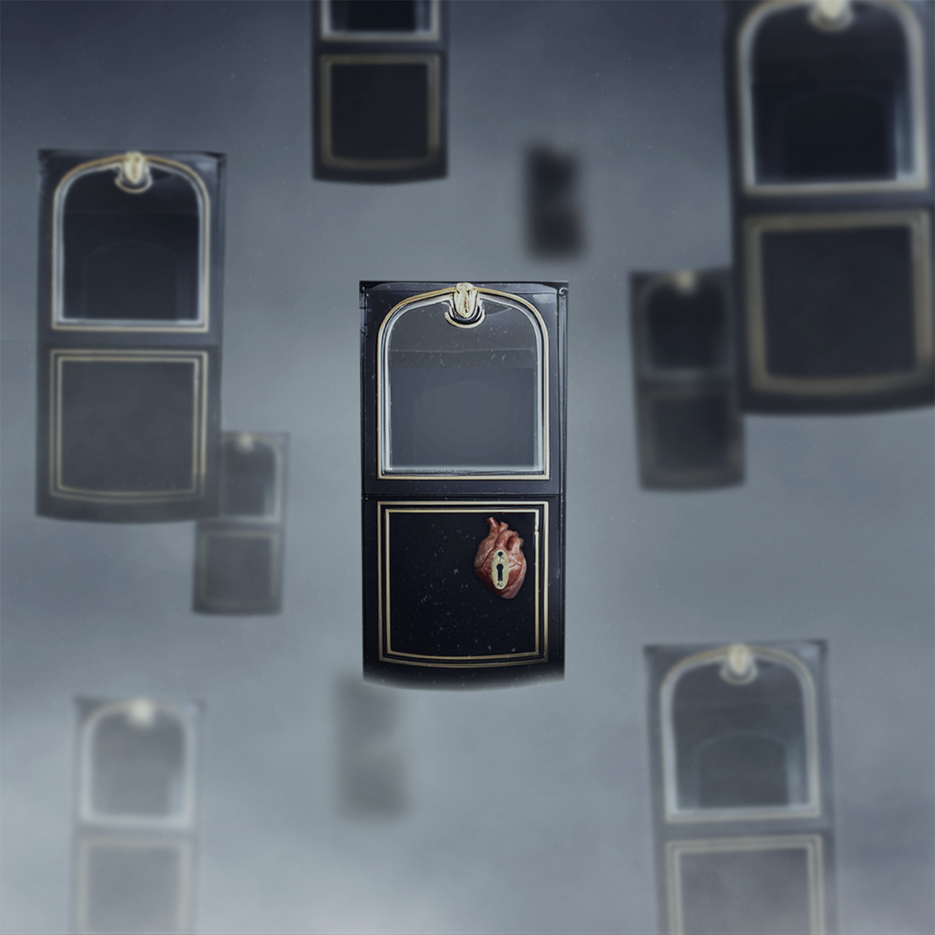
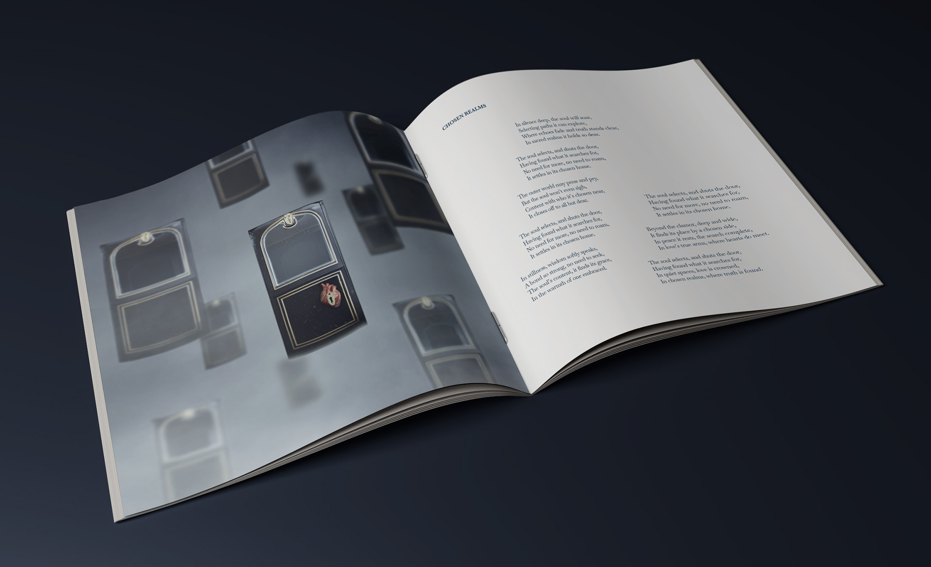
Chosen Realms: This artwork symbolizes the soul's choice and its unique connection. The floating doors represent different options, but only one, marked by a heart and lock, is the final decision, accessible only through love.
I’m Nobody: White Noise floats above death, symbolizing the search for identity. Its figure shines, while the fog and sea reflect uncertainty and the internal process of self-discovery. The image conveys that the truth lies in introspection and serenity.
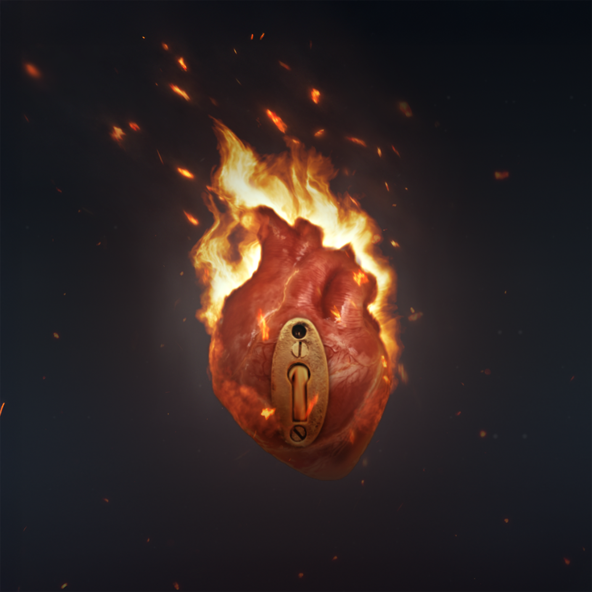
Untamed Nights: A heart wrapped in flames symbolizes intense passion. The golden lock suggests an intimate desire, while the cracks in the heart show internal tension. The contrast between fire and the dark background reflects the intensity and vulnerability of passion.
Unseen Bonds: The broken dishware symbolizes fractured relationships. The scattered fragments represent bonds broken by time, while the fog and dark background reinforce the melancholy and fragility of the concept.
The Silence Of Solitude: The cover shows White Noise surrounded by dense fog, symbolizing the solitude of life’s final moments. Its figure, faint yet shining, stands out in the void, while the layers of fog reinforce isolation and introspection.


The animations are a visual extension of the artworks, designed to complement and bring the covers to life on platforms like Spotify. With a duration of 8 seconds, each animation reinforces the concept and atmosphere of the static image, adding dynamism and depth to the themes. The goal is to create an immersive visual experience that captures the essence of each song, amplifying the narrative through movement.
BOOKLET
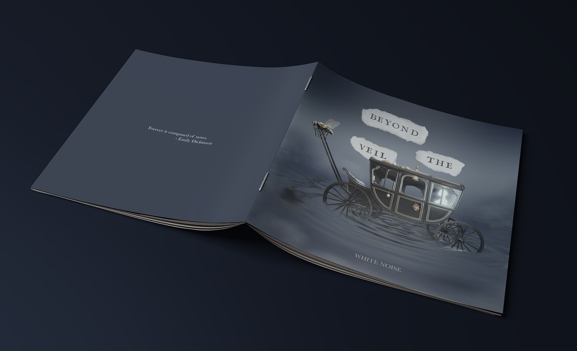
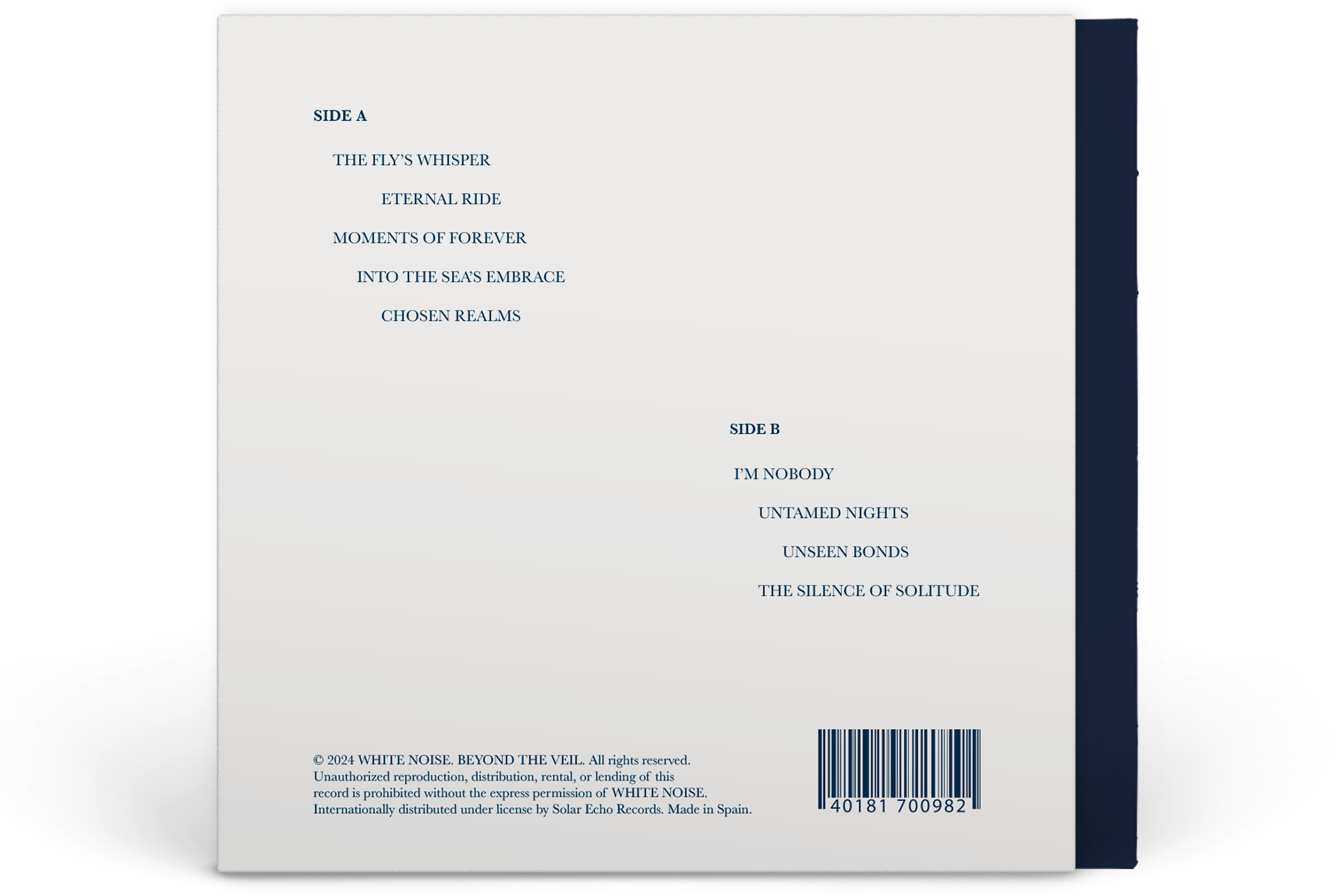
The White Noise booklet (vinyl and CD) visually complements the album. In vinyl, the expansive designs offer a wide visual experience, while on CD, it adapts to a more compact format. The left pages display the artworks, and the right pages feature the lyrics, creating a fully immersive experience. The texts, in distinctive blue, are arranged fluidly, evoking the movement of water. The back cover pays homage to Emily Dickinson with the phrase "Forever is composed of nows," closing the concept of time and eternity.
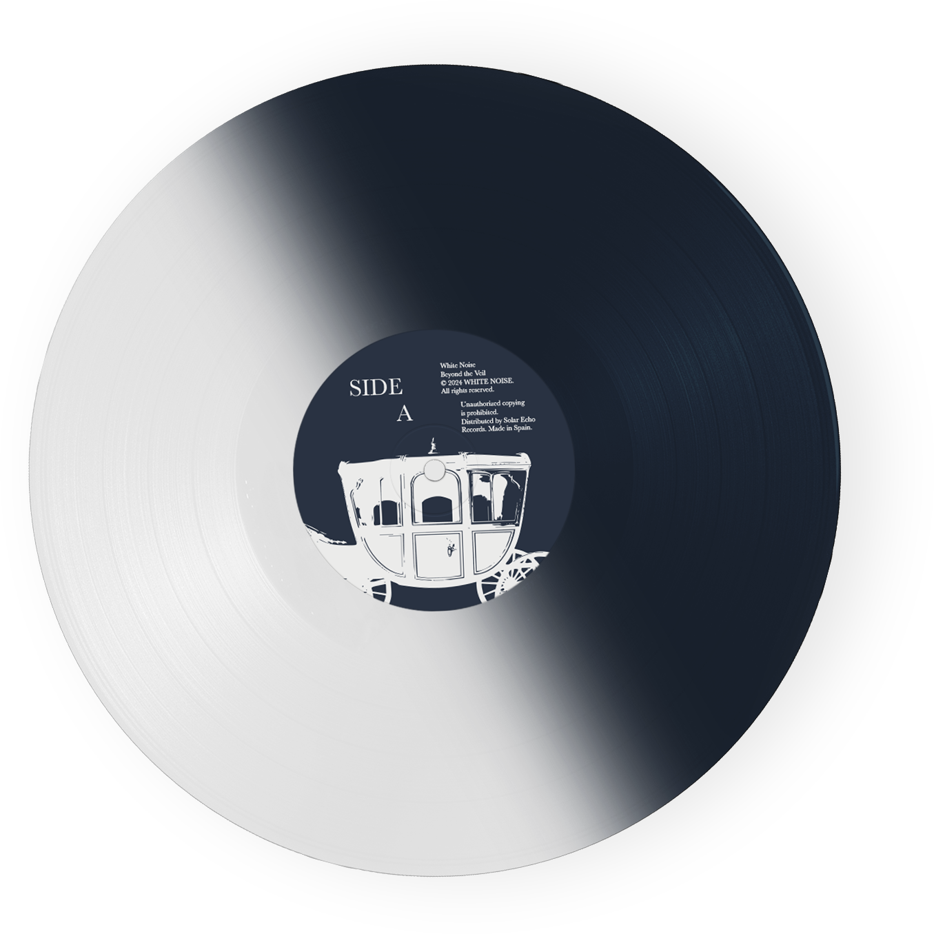
PHYSICAL FORMATS AND EDITIONS
The vinyl is the chosen format for White Noise, connecting with the nostalgia and emotional themes of the album. It is available in 4 versions:
- White Vinyl: Represents transcendence and peace at the end of the album.
- Bicolor Vinyl (White and Dark Blue): Symbolizes the duality between darkness and peace.
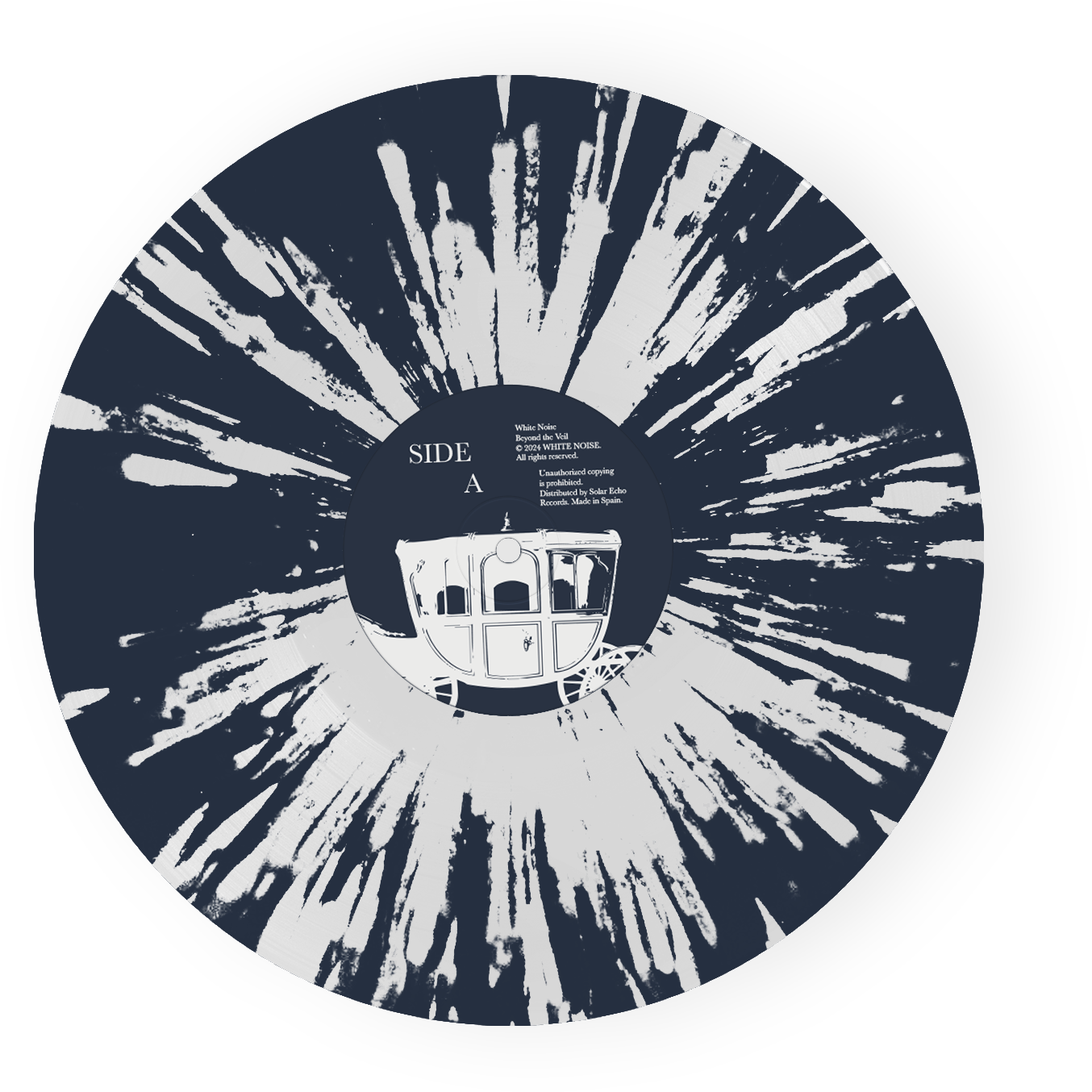
- Splatter Vinyl (Transparent with Dark Blue Splashes): Captures the transformative explosion of death.
- Picture Disc: A collectible item that highlights the album's cover.
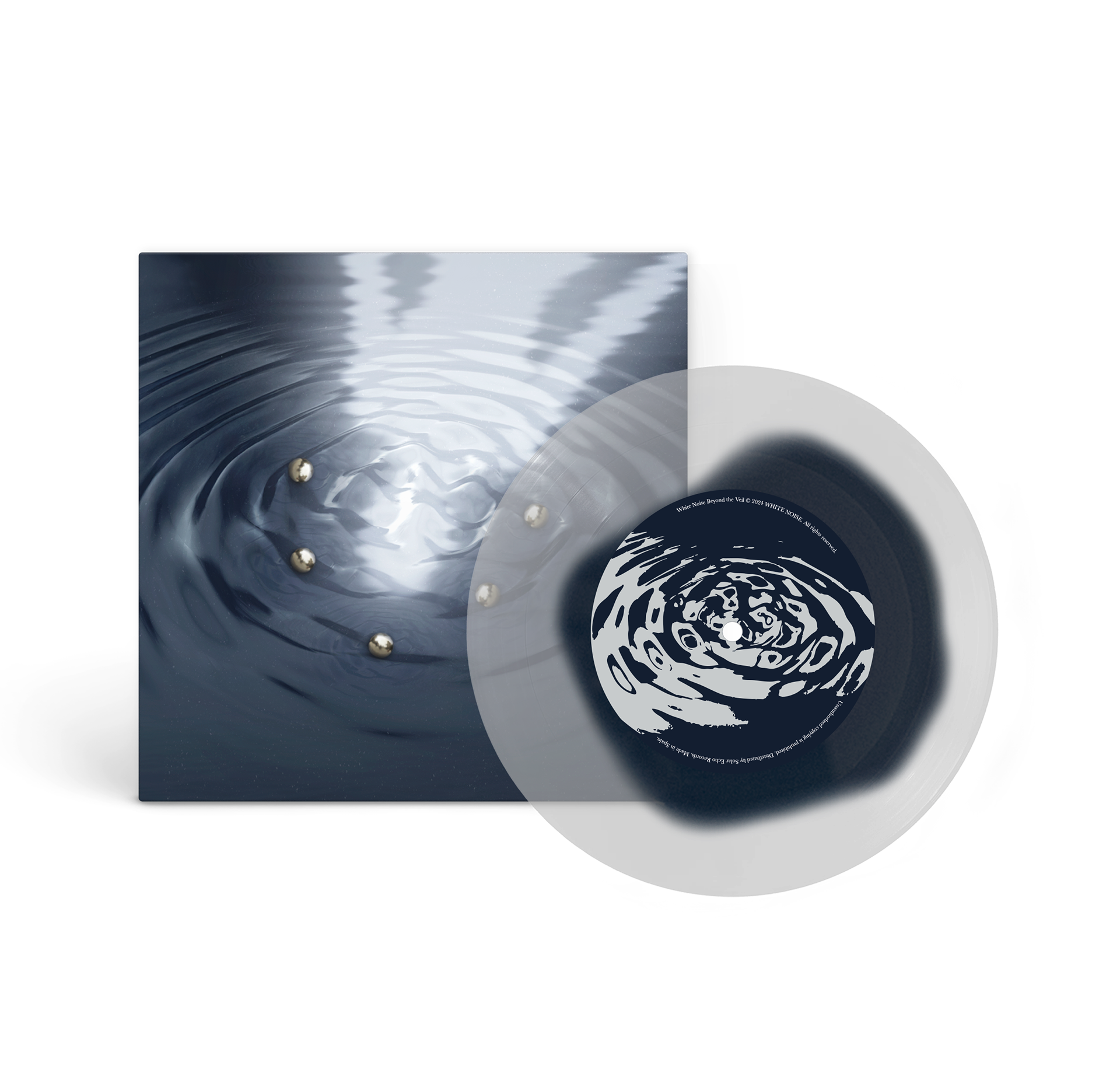
As a special addition to the album, the 7-inch vinyl for Into the Sea’s Embrace features a transparent design with an irregular dark blue stain in the center, symbolizing the sea and death.
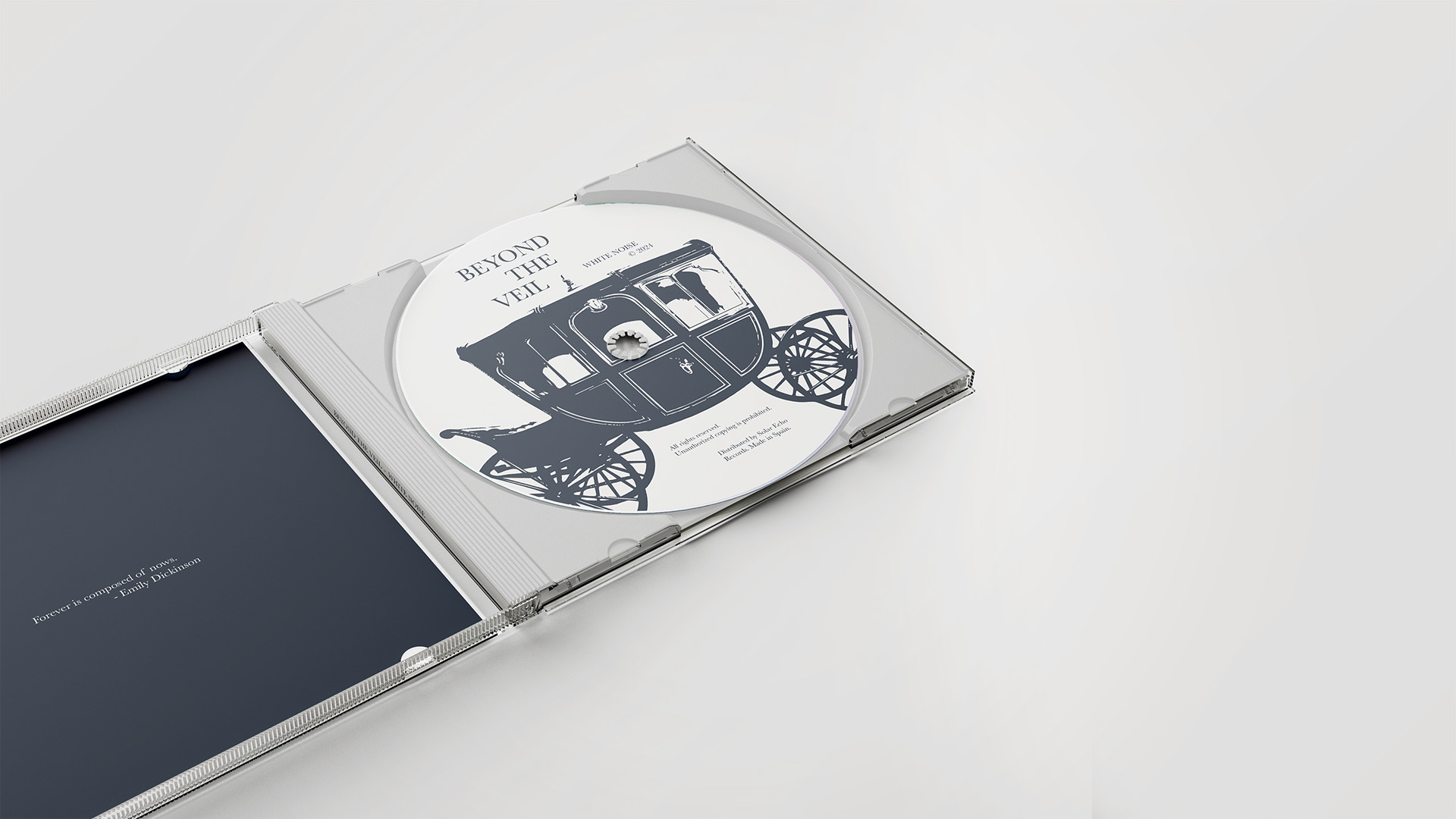
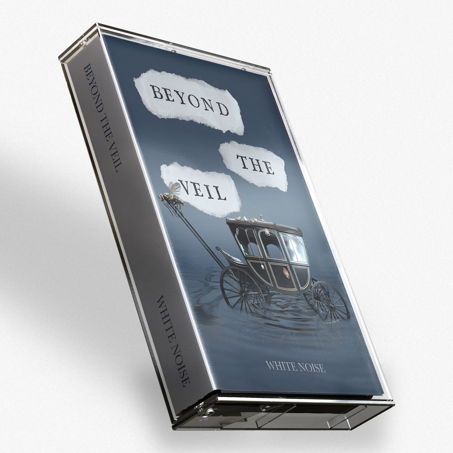
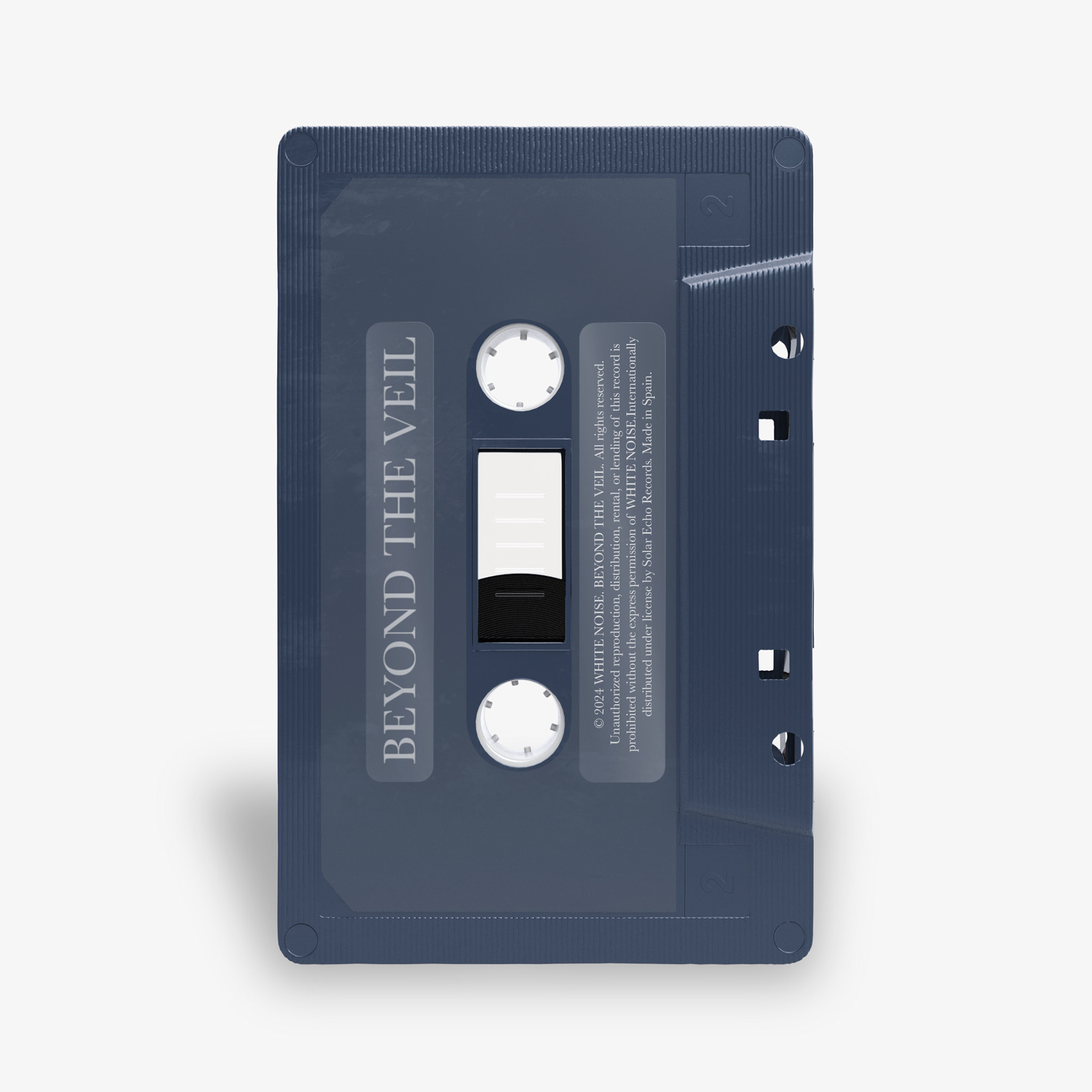
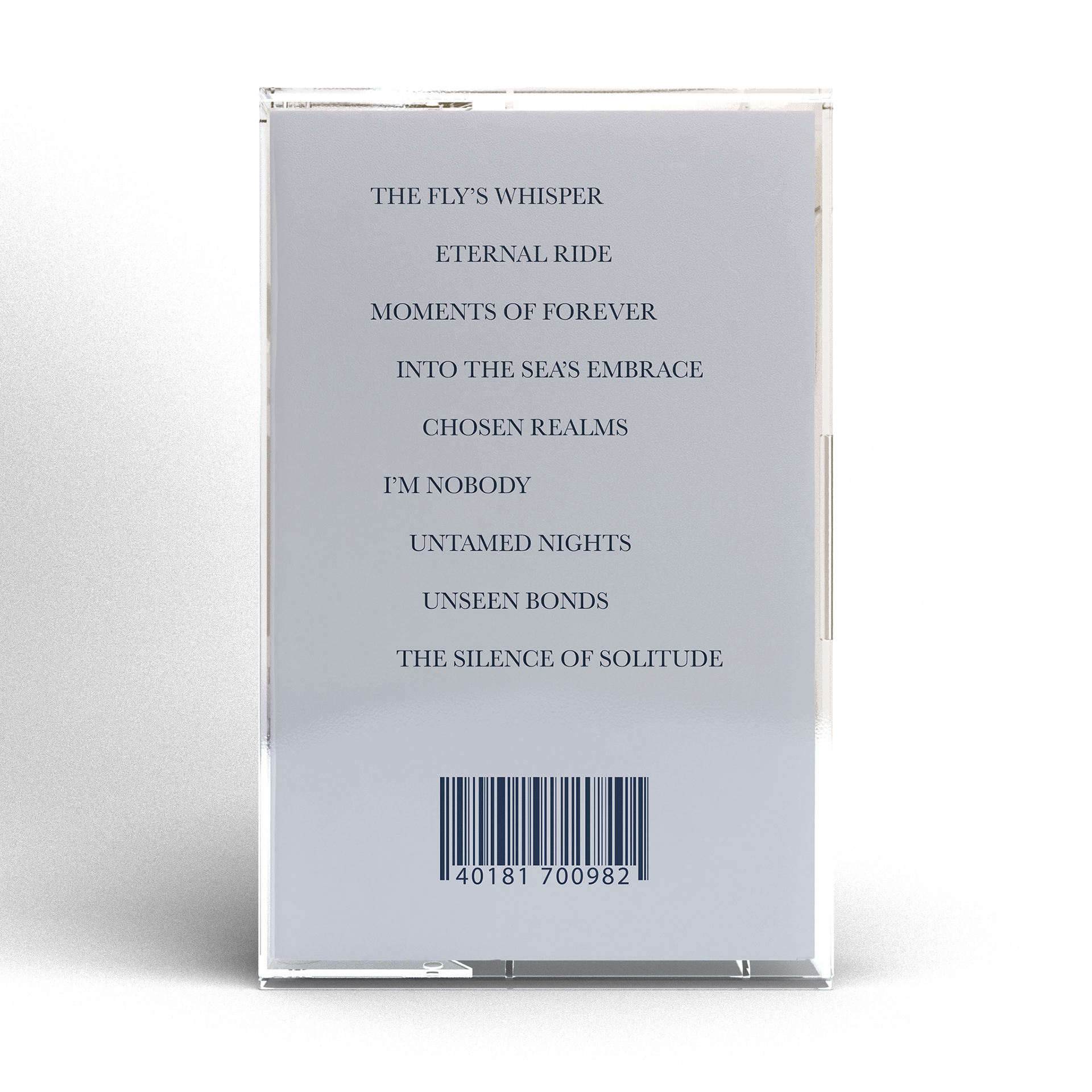
CD & Cassette
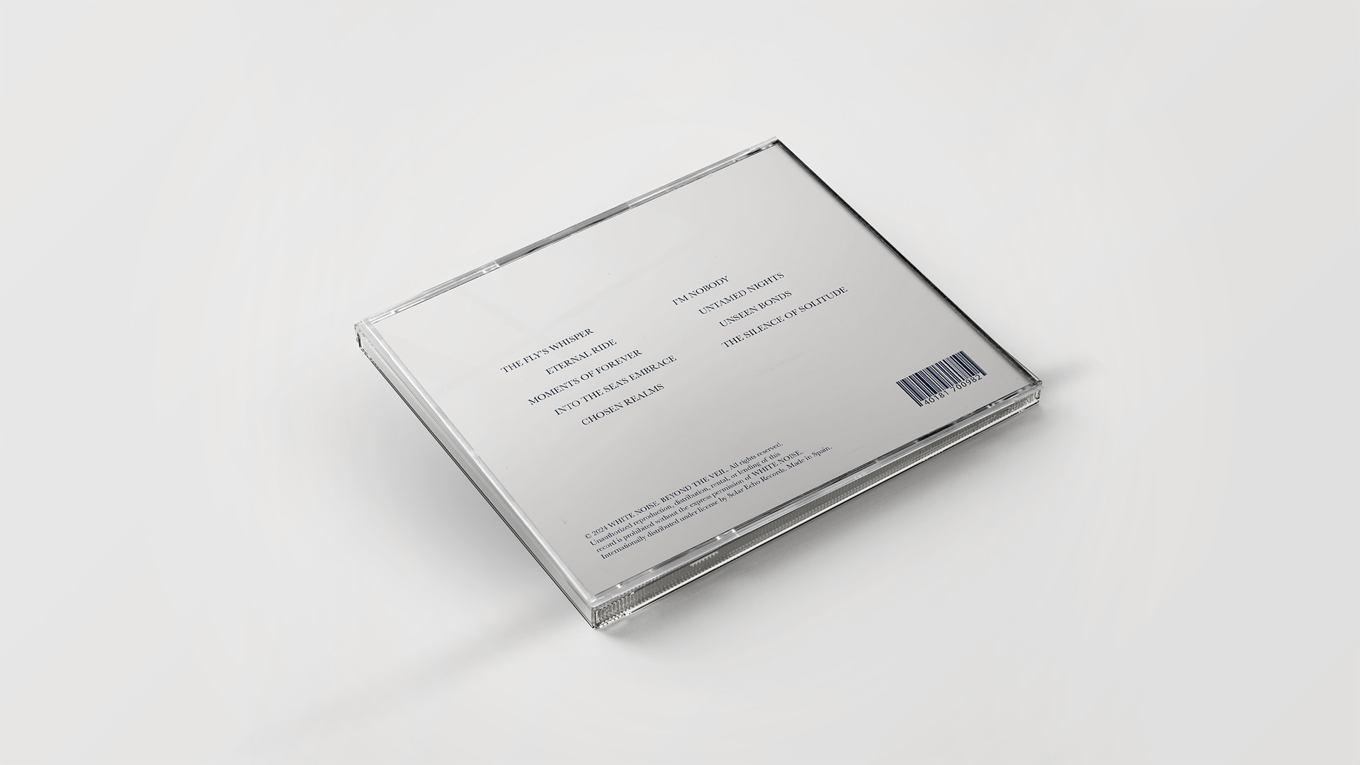
The CD and cassette have been adapted to provide accessible and collectible options. In both cases, the artworks, lyrics, and song arrangement have been adjusted to the respective formats, maintaining the album's aesthetic cohesion and offering a complete visual and auditory experience.
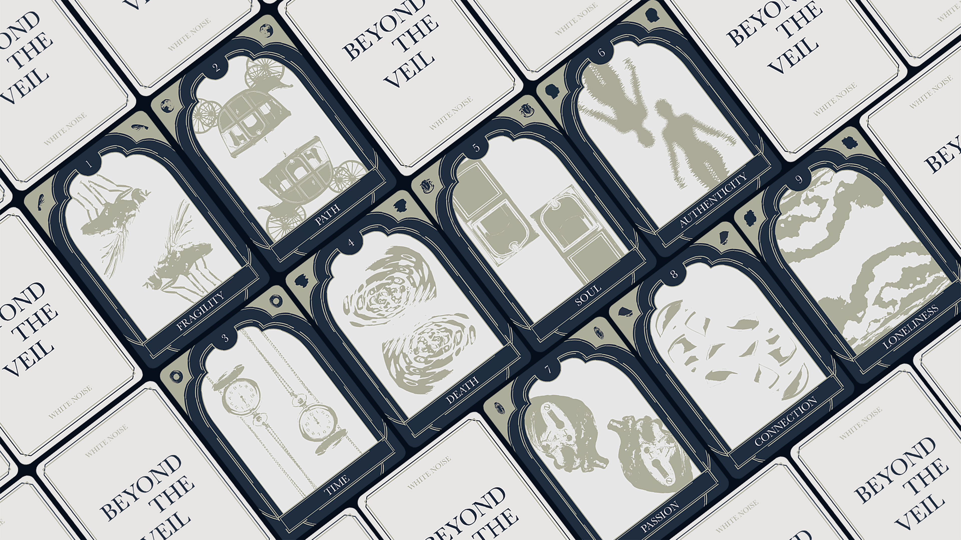
TAROT CARDS
The tarot cards reflect the emotions and key concepts of the album:
1- : The fragility of life.
2- : The path traveled or yet to be traveled.
3- : The fleeting and transient nature of time.
4- : Death, something inevitable.
5- : The soul chosen to share your life.
6- : The authenticity of oneself.
7- : Unbridled passion.
8- : The connection that unites us and breaks apart.
9- : The solitude and silence.
Cada carta, con un marco inspirado en la ventana de la carroza, utiliza elementos gráficos del álbum. En las esquinas superiores se encuentran símbolos representativos de cada carta,
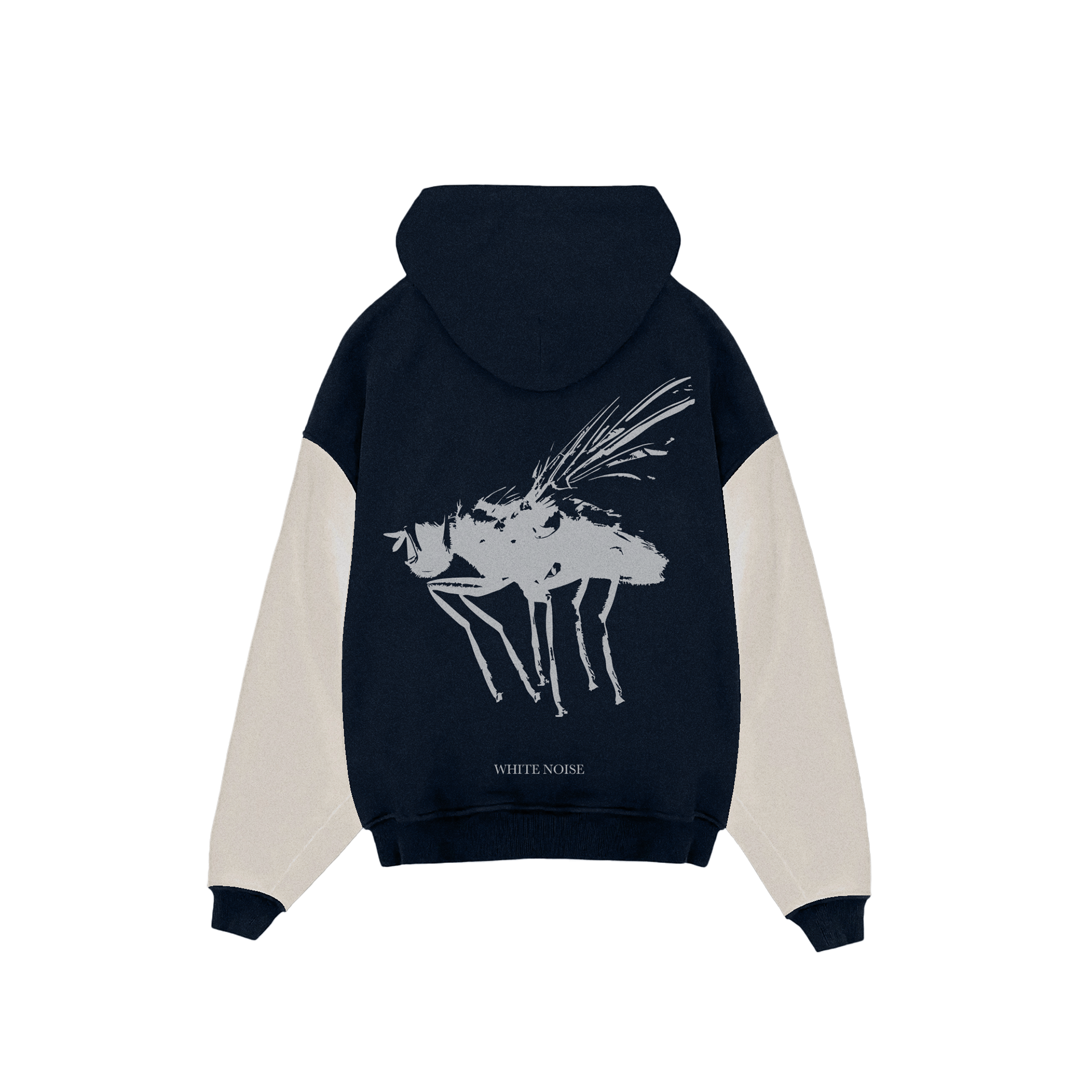
MERCHANDISING
Finally, the Beyond The Veil merchandising extends the album experience beyond music, transforming its visual and emotional elements into tangible objects. These items allow fans to integrate the essence of the album into their everyday lives.